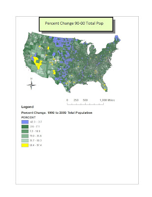
GIS, a field of study that helps us look at our world in and informative new way. The following maps are a testament to understanding a new discipline and taking time to learn through trial and error. These maps are a commentary on geography and mapping in ways that couldn't be done without the technology we have today. The enterprising nature of this field has lead me to the creation of these census maps. These maps go over the United States continental population from 1990 to 2000. Below is my first map. It displays the difference in population from between 90' to 00'. I have highlighted in light blue the biggest decline in population, as opposed to the yellow, which is the largest growth in population. The vast majority of counties remained in the same population zone as the decade before, while very few grew or shrank with any significance.
This is my second map. It shows the number of people in each county of the US in 2000, resulting in the Total Population. With Burnt Red representing the
biggest populations and creamy cream representing smallest populations,
it's a good way to get a feel for the population for the year 2000.

This orange flavored map has hints of lime. It displays the Population Density. The lime represents the cities with an average population density between 3000 and 100, while the orange represents populations less than 100 and blue represents more than 3000. We can see that the major cities in the US hold the highest, blue, benchmark - such as LA, Chicago and New York City.

This final fourth map displays the percent change in cool tones. The yellow stands out because it represents the largest percent changes, while the soft purple represents negative changes. This map is interesting because it has the total population as a percentage, which shows the rural areas in the country as well as displaying where people are fleeing from.


No comments:
Post a Comment