Tuesday, November 27, 2012

J. Roney Lab 8 - Fire Map


The Effectiveness of Fire Hydrants

        This report will display the effectiveness that fire hydrants and firemen have on containing fires. This particular case is the Station fire in LA County in August and September of 2009. This fire was located just North of San Fernando and east of Santa Clarita and threatened the both community's. Arson was expected to be the cause, and the fire later lead to the death of two firefighters.

       Our first map shows the area the fire affected the Angeles National Forest. its beginning stages started north of San Fernando and keep moving northward. This "reference map" shows the first six stages of the fire and its expansion outward.The deepest red represents the initial stage, followed by lighter shades. The lighter shades do not suggest the fire weakening, it only represents the area as a time lapse. For reference, the 14, 210, 5, 101 and 118 freeways are included in the map as well as notes for Santa Clarita and San Fernando.


       A major element of stopping a fire is the use of fire Hydrants. Before plotting the specific locations for new fire hydrants, the fire chief or his/her delegated authority must be consulted to ensure that all operational and practical issues have been considered prior to final placement of hydrants. This is a strategy of containment that can be observed through ArcGIS.
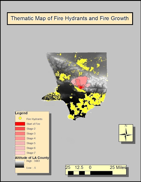


     The above map displays the fire hydrants in the LA County as well as the growth of the fire. Again, the initial onset and the stages of the fire appear here, but now we can see the placement of Fire hydrants installed by the LAFD. the northern portion of San Fernando is covered with the Hydrants.

    We can see the effectiveness of the fire department here in the virtual wall of hydrants that have stopped the fire from proceeding into the city. Donna Barstow,a commentator of the 2009 Station fire, mentions how crucial it is for firehydranst to be operational near fires. She writes, "'we don’t chase fires, we just contain it.' And since they don’t have any large off-road fire trucks, their range is limited to the length of the hoses: only 300 to 500 feet!"   Looking at the spread of the fire over time, we can infer that the fire hydrants played a crucial roll at containing the fire and keeping firefighters on the front lines.


----

Work Cited

Smith, Tim J. "Los Angeles County Fire Hydrant Layer." Map. Los Angeles County GIS Data Portal. LARIAC, 23 May 2012. Web.

Franchino, Nick. "Freeways (Single Line for Labels)." Map. Los Angeles County GIS Data Portal. Los Angeles County Regional Planning Department, 20 Jan. 2011. Web.

LAFD Staff. "LAFD Construction Services - Hydrants and Access Unit." LAFD Construction Services - Hydrants and Access Unit. LAFD, n.d. Web.

Barstow, Donna. "Griffith Park Blog." Griffith Park Blog RSS. WordPress, 2 Sept. 2009. Web.

Winton, Richard. "L.A. NOW." Substance Found near Station Fire Ignition Point Is Key Evidence in Arson Probe [Updated]. LA Times, 4 Sept. 2009. Web.

Monday, November 26, 2012

Jack roney - 4 Maps - Lab 7


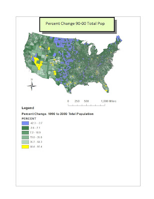
GIS, a field of study that helps us look at our world in and informative new way. The following maps are a testament to understanding a new discipline and taking time to learn through trial and error. These maps are a commentary on geography and mapping in ways that couldn't be done without the technology we have today. The enterprising nature of this field has lead me to the creation of these census maps. These maps go over the United States continental population from 1990 to 2000. Below is my first map. It displays the difference in population from between 90' to 00'. I have highlighted in light blue the biggest  decline in population, as opposed to the yellow, which is the largest growth in population. The vast majority of counties remained in the same population zone as the decade before, while very few grew or shrank with any significance. 

This is my second map. It shows the number of people in each county of the US in 2000, resulting in the Total Population. With Burnt Red representing the biggest populations and creamy cream representing smallest populations, it's a good way to get a feel for the population for the year 2000.


 This orange flavored map has hints of lime. It displays the Population Density. The lime represents the cities with an average population density between 3000 and 100, while the orange represents populations less than 100 and blue represents more than 3000. We can see that the major cities in the US hold the highest, blue, benchmark - such as LA, Chicago and New York City.


This final fourth map displays the percent change in cool tones. The yellow stands out because it represents the largest percent changes, while the soft purple represents negative changes. This map is interesting because it has the total population  as a percentage, which shows the rural areas in the country as well as displaying where people are fleeing from.


Tuesday, November 13, 2012

Jack roney - Lab 6


 Lab Six

The area I selected was from the GCS system labeled  North America 1983.
the extent information four the top left right and bottom are as follows respectively, 39.829, -105.78,  -104.9694 and 39.383. With and Angular Unit degree of 0.017. These are the set of images I used for this lab, and contain the previous source information. 


Monday, November 5, 2012

Lab 4 - Jack Roney

       Arcmap is a powerful tool that lets you create effective maps that look both professional and stylish. The tutorial was extremely tedious, several times I opted out of working and contemplated dropping out of UCLA. However, after the first forty pages or so, you start to pick up on how the tutorial works and the frustartration eases a bit. By the last 10 pages, you can start to understand the power behind Arcmap, its potential and effectiveness.  Patience was key.
       The potentials seem endless, if you put your creative mind to it, you could do almost anything with this program. Mapping geographical spaces and potential urban planning is a skill that could be harnassed by really anyone who sat done and learned the program. Imagine Urban planning in which every person could submit their unique idea to a city planner?Additionally, integrating this tool with something like Google earth would be mind melting. Being able to cross the map I created with satellite imagery as a layer would make it even more powerful.
        The pitfalls are mostly that its extremely tedious. There may be some small glitches running around in the program. Its possible that I haven't mastered the program and I just wasn't sure why some things were acting in a certain way. But that's a personal issue. As far as actual pitfalls of the program, ArcMap could support a better graphical appearance. If it could somehow show more depth in these maps besides just the splitting of colors that would be neat. For example, Google earth! Also, where did the data come from? The actual original mapping of the airport? Was that difficult to create?
      All in all, I enjoyed this lab. Yeah, it took three quarters of a century, but at the end of the day, you learn to use a pretty useful tool. Thanks ArcMap!


Sunday, October 21, 2012

Jack Roney -- LAB 3

       Here it is Ladies and Gentlemaps! Jack Roney's Google Map. Ahh Neogeography! Much like a writers pen, a neogeographer's map can push and redline the viewers of his work to whatever the crafter may whim! For example, I created a map which has a clear bias on economically competing areas, Kailua and Waikiki. At first look, this map appears to be a cheesy creation for tourists moseying around Oahu. In reality, Kailua's city council slipped me a roll of bills under the table. If this map were published and distributed wide scale, it would isolate an entire demographic of profiteers in the war for tourist's business in Hawaii. While Waikiki gets no publicity, the hopelessly boring atmosphere of Kailua is made to look utopian.
       Furthermore, exact pitfalls in the school of Neogeography come at the price of accuracy. When we use pre-existing toolkits to do a job, we may not get the exact results we are after. It feels like using a mismatched wrench for an undersized bolt. Yes, Google maps got the job done, but what it didn't allow me to express each and every detail I was looking for. It has given me new perspective on map creation as a whole. Maybe the best maps out there are done by individuals who dedicate themselves to stay away from Neogeography?

Monday, October 15, 2012

Lab 2 - Jack Roney


1) Beverly Hill Quadrangle
2)Canoga Park, Van Nuys, Burbank, Topanga, Hollywood, Venice, Inglewood
3) The topograph was compiled in 1966, and the current map was published in 1995.
4) The Datum was created in 1927
5)The map scale is 1:24,000
6  a) 5 cm is about 1,200 meters
    b) 5 inches is around on the map 1.9 miles
    c) 2.64 inches.
    d) 12.5 cms
7) The contour interval is 20 feet.
8   a)    34.074524,-118.439217 And 34° 4' 28.3" -118° 26' 21.2"
     b)   34.007673, -118.499748 And 34° 0' 27.6222"  -118° 29' 59.0922"
     c)  34.007495,  -118.499936 And 34° 0' 26.9814" -118° 29' 59.7696"
9  a) About 550 feet, or 167 meters
    b) About 140, or 43 meters
    c) Around 600-700 feet, or 182 to 213 meters
10) The map is in UTM zone 11.
11)0*48'/14 MILS GN
12)1000000sq meters
13) Sorry for the formating issues, I cant quite get map graph to cooperate. The Y axis is the elevation in feet, while the numbers 1-12 on the bottom correspond tothe elevation measurments from east to west along  the UTM northing 371000,

14)14*/249 MILS MN
15) South West
16)

Tuesday, October 2, 2012

Jack Roney -- Assignment 1. Three maps.


Donegal Map Rail
http://imgur.com/yLw4o
I found this map and the next one on Reddit, an online community that is dedicated to quirky interests, such as extreme sports, fishing or trees.  There is a small section within this online community there that enjoys maps, and some users go so far as to create their own maps. This map in particular was created back in April by the user keanehoody. This map is a theoretical map of the rail ways in Donegal County, Ireland. I really enjoy theoretical maps, especially when they are created by amateur cartographers. It lets the us interpret and view parts of the world in a non conventional vision, and familiarizes us with parts of the world we may not be well traveled in.


Realistic London Tube
http://www.phoenixproductions.org.uk/SillyTubeMaps/geoff-files/sillymaps/large_geographical_map.gif
I also found this map on Reddit, however it was not created by the community. This map was shared on Reddit but was conceived over at phoenixproductions.org.uk. This shows the realistic distances and routes of the tube in London. We can see the drastic contrast between this map and the conceptual map from above. Although they are not of the same subject, you can clearly see the intricacies of reality, as opposed to the organized simplicity of the system presented in the previous map.

http://www.phoenixproductions.org.uk/SillyTubeMaps/geoff-files/sillymaps/large_geographical_map.gif
Topographical Map of Hawaii
http://gohawaii.about.com/od/bigislandmap1/Big_Island_of_Hawaii_Maps.-Qpq.htm

 I found this map at About.com under maps of Hawaii. It's a simple topographical map of the island of Hawaii. It shows the elevation of the island from sea level all the way to the top of Mauna Kea, at 12,000 feet! I love topographical maps because it represents three dimension on a two dimensional space. I am particularly interested in this one because I have been to this island and seem this mountain, and it is incredible that something so large can be organized as easily as this map is.